WELCOME TO THE ZONE NINE BRAND GUIDELINES.
This document defines the visual and verbal essence of our brand. Your discretion is key, as these principles are meant to guide rather than dictate.


TABLE OF CONTENTS
LOGO SIZE
The minimum heigh of the logo is 15 pixels. If the logo falls below 15 pixels then the logo will fail to reveal it's identity. So it is recommended to keep the logo within minimum 35 pixels.
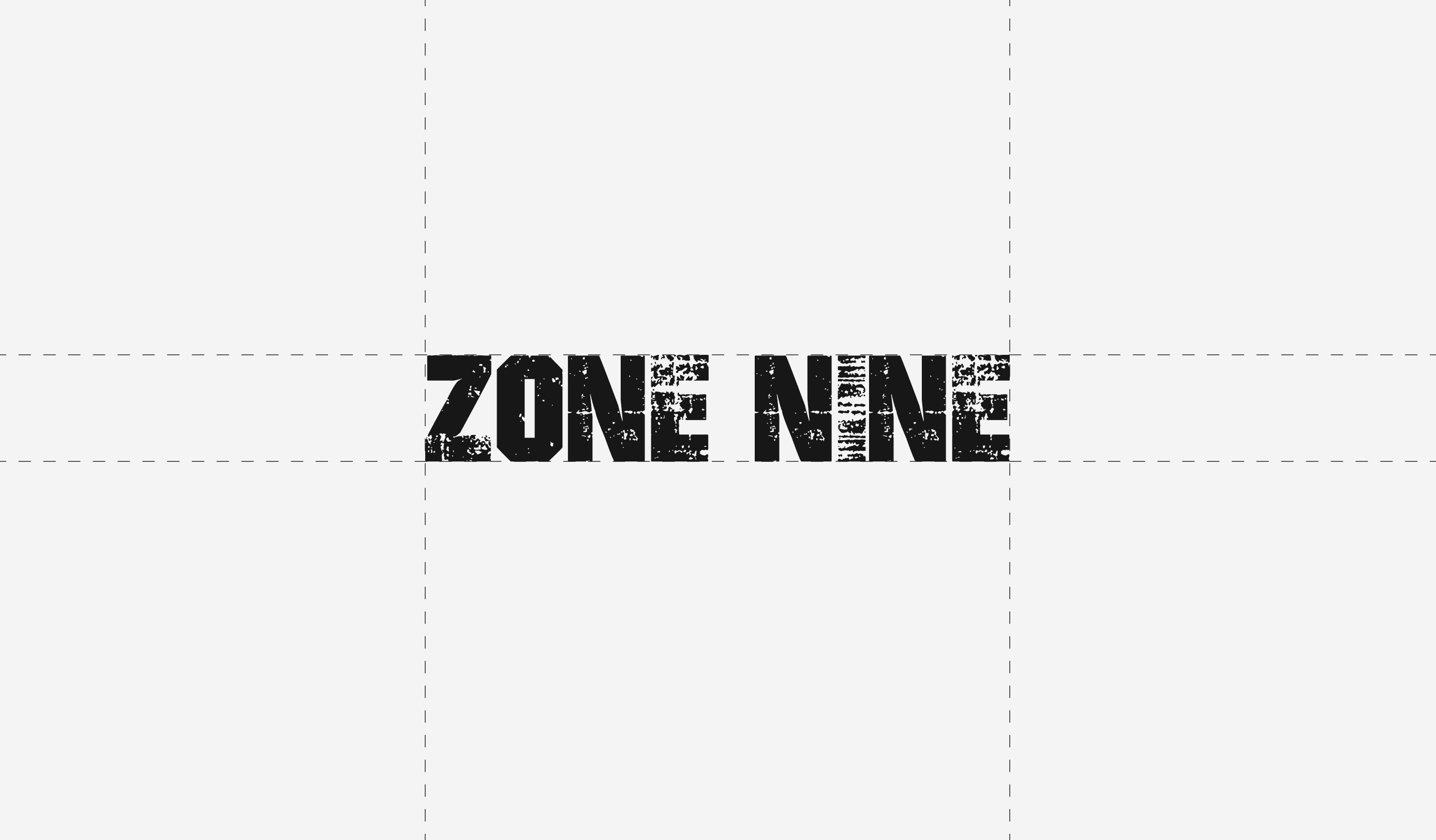
LOGO GRID
Logo grid is a Design Ordering System tool created by using shapes to create geometric harmony in a logo or helpful to understand the construction for the reconstruction of the logo.
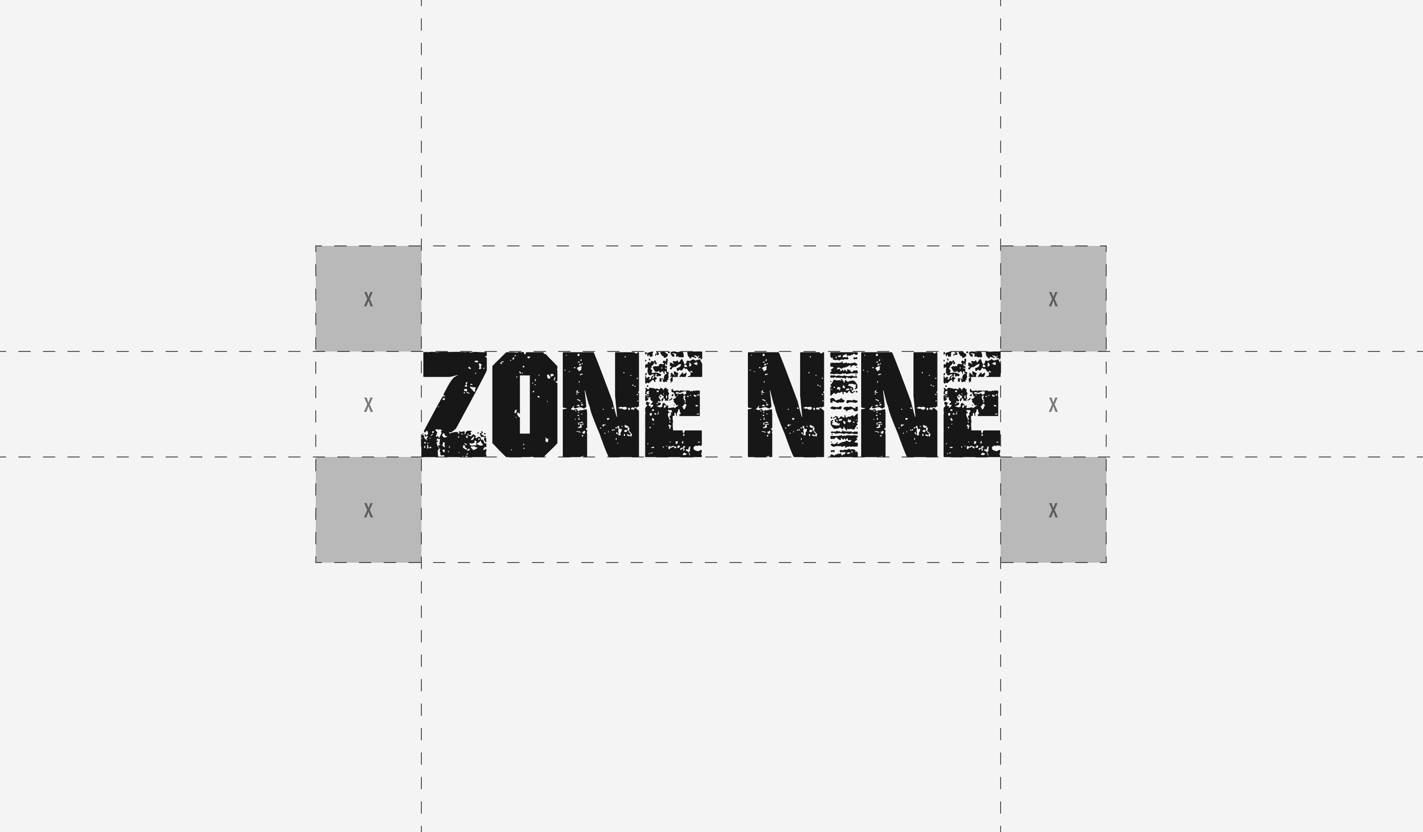
LOGO CLEAR SPACE
Avoid overcrowding the logo. When positioning other elements nearby, maintain sufficient clear space to uphold brand consistency.
LOGO VERSIONS
On lighter backgrounds, employ our logo in darker colors. On darker backgrounds, opt for lighter-colored versions of our logo.

DO NOT
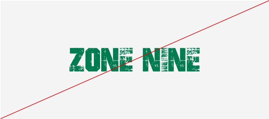
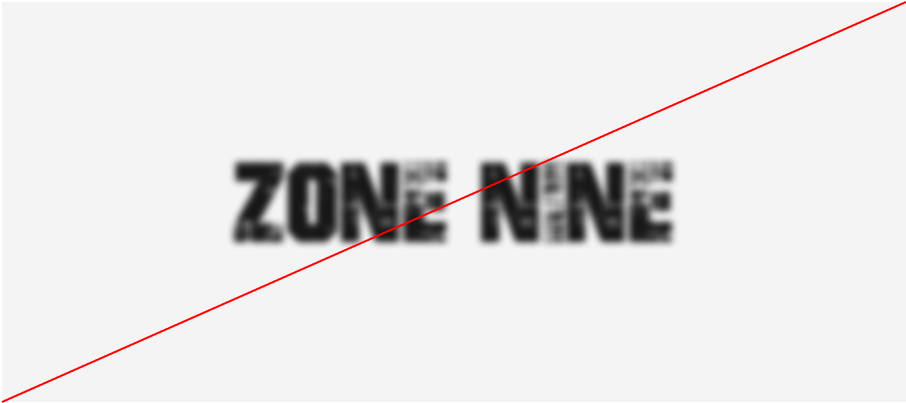
Do not modify the logo. Refrain from using the following applications.
Do not stretch the logo
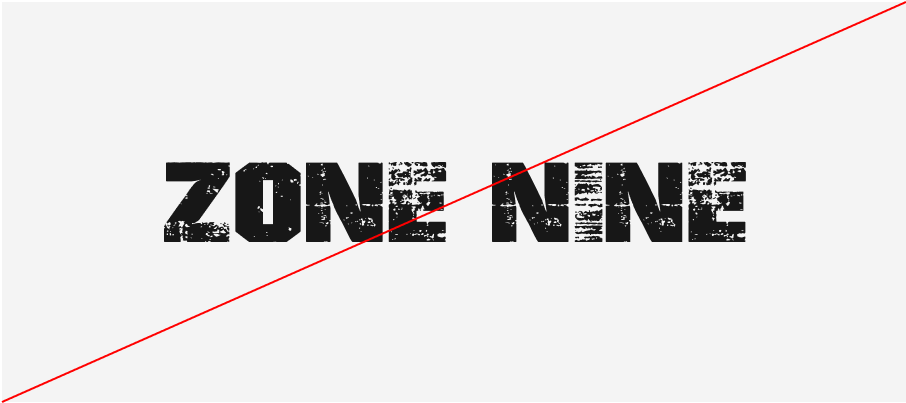
Do not add stroke
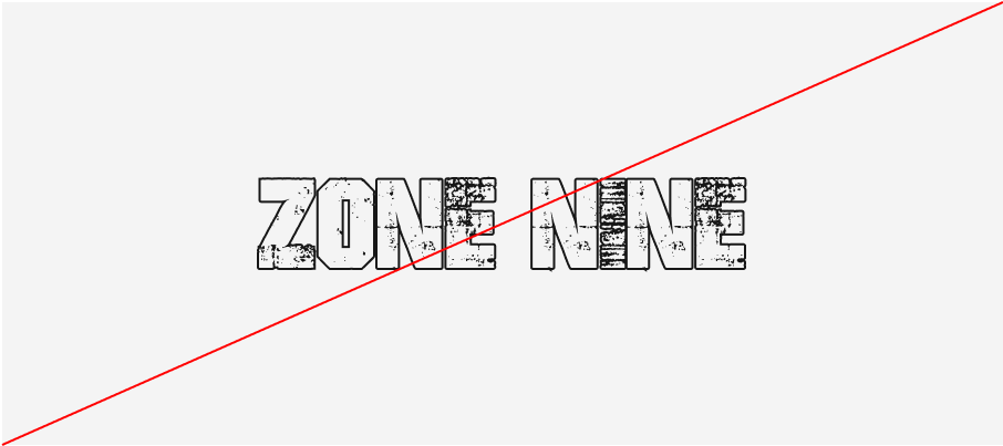
Do not add to much shadow effect
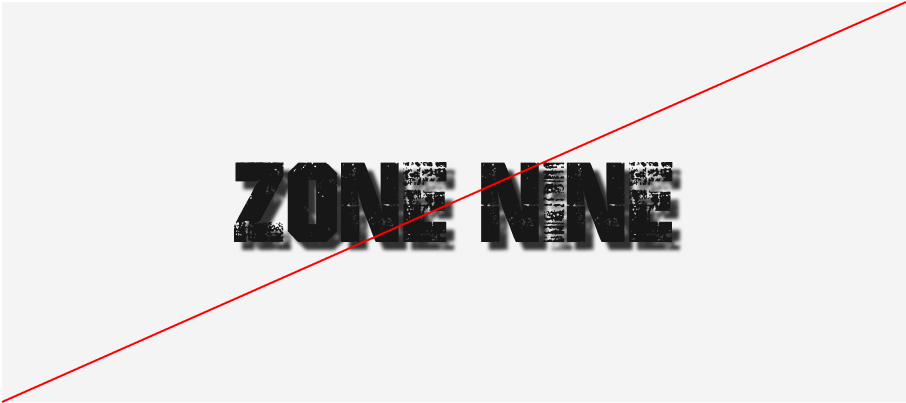
Do not position of an angle
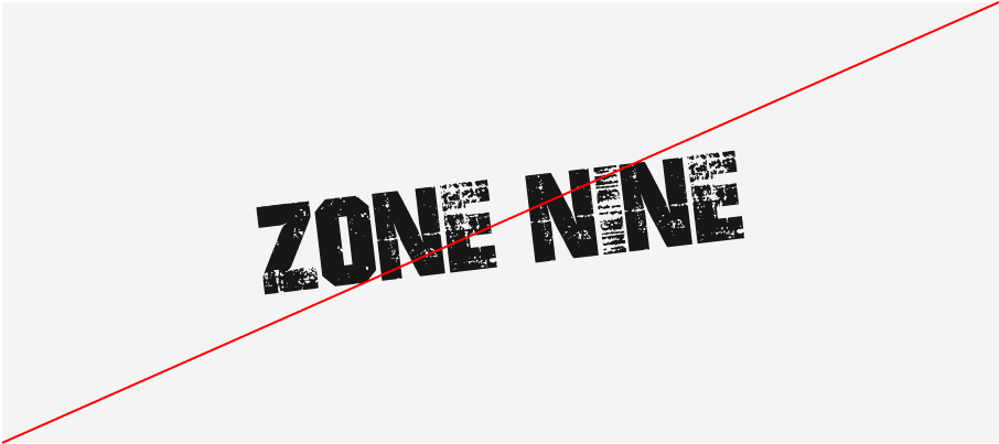
Do not use unapproved color
Do not add blur effect
TYPEFACE
Typefaces convey an organization's voice to the reader. It's crucial to utilize them when appropriate.
COLORS
COLOR PAETTE
Color holds significant importance in defining our identity. Through color, we shape the expression and character of our brand.
CMYK: 3%/2%/2%/0%
RGB: 244, 244, 244
HEX: #F4F4F4
CMYK: 3%/22%/73%/0%
RGB: 246, 198, 96
HEX: #F6C660
CMYK: 5%/100%/100%/1%
RGB: 226, 0, 0
HEX: #E20000
CMYK: 73%/67%/65%/80%
RGB: 23, 23, 23
HEX: #171717
VIEW THIS GUIDE AS THE FOUNDATION OF OUR BRAND. WE'VE OUTLINED THE FUNDAMENTAL PRINCIPLES THAT WILL CONTINUE TO MOLD OUR BRAND IDENTITY MOVING FORWARD.

